If you are a web designer or just a user interested in mobile and web technology you should be heard about Retina-Ready.
what is ‘Retina-ready’ mean?
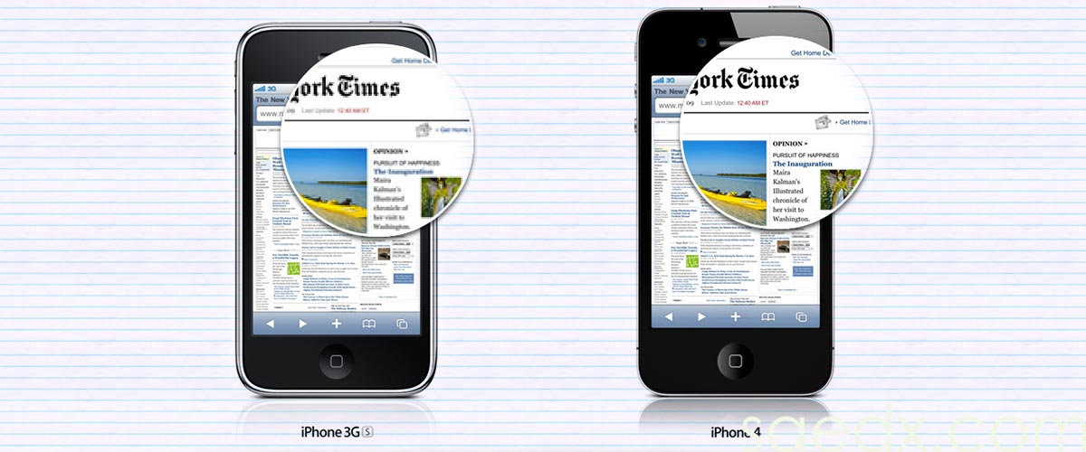
It is a term generated by Apple with the appearing of the iPhone 4.
iPhone4 display size is 3.5”, at a resolution of 960 x 640 pixels. At this resolution, at an optimal viewing distance, the human eye struggles to identify individual pixels, so the technology was branded retina display.
Retina display devices show more pixels per square inch, producing sharper images. A pixel is the smallest physical unit in a display.
The main goal of Retina display is to improve the UX (user experience) which can make device screen quality almost on a par with print quality.
How ‘Retina-ready’ affecting website?
What is important to understand is that on Retina devices, HQ images (more pixels per square inch) are required.
iPhone 7 as an example is Retina display device which displays a website that serves Retina-ready graphics (HQ) will display sharper images and brighter, more vivid colors.
iPad3 or less serving non-Retina images (low resolution) will result in poor quality images and a less than optimal UX (user experience).
what if your website not Retina-ready?
a web designer can upgrade a web graphics and content images. There are many techniques and tools available to do this (depending on website structure, image types and browser options). the website designer will choose the best options for your website.
If you are currently considering purchasing a new website design, then make sure that retina ready is in bold on your requirements list.